8.30.2014

Tumblr things

So besides the world-building project, I've been doodling here and there, too.


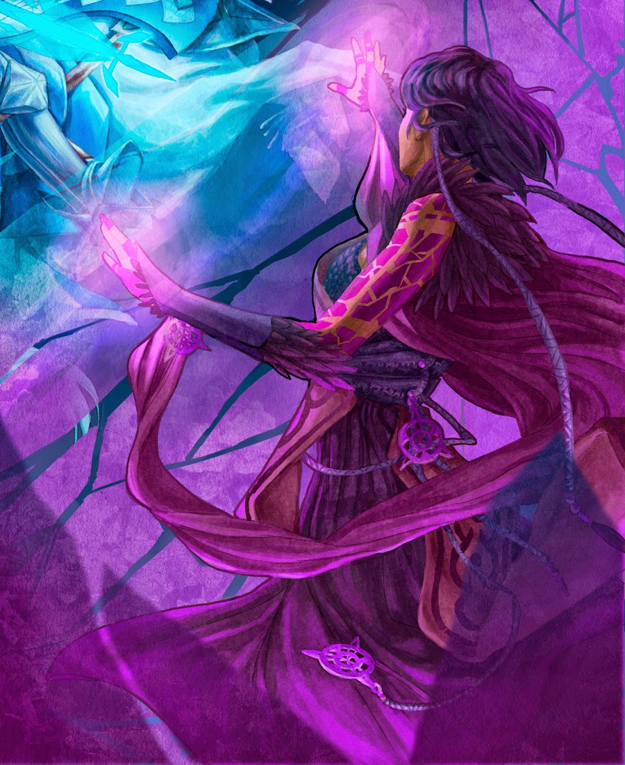
I decided to submit a demon to Ava's Demon Design Your Demon contest on tumblr. I didn't get to have much time to figure out thumbnails on how I wanted my demon to look, so I just worked from the list of features I had in my head that I knew I wanted to draw and went from there. I'm still surprised it came out as well as it did and I enjoyed coloring this a lot. I'm especially proud of how the hair and the cracks on the dress came out. I originally attempted to have the demon's irises glowing through the thin skin of her closed eyelids, but that was a lot harder to translate into drawing than expected so I simply just made them all normal eyelids with one opened.

But yeah, a description to this demon lady was welcomed for the contest so I'll just retype what I wrote before about her:

"This demoness, while not malicious, has a tendency to see her past and future in rose-colored lens without being aware that neither times are ever perfect (thus the cracks in her otherwise fluffy, elegant form). She always laments that there were/will be better times and is never satisfied with the present enough to be truly happy. She is rather charming and courteous, but that unfortunately only makes it easier to sway her pactmaker into doubting all her choices with insidious criticisms and passive-aggression.

Her name is Melin Mirala, the name adapted from Melinoë (nymph who was known for bringing nightmares and misfortune) and mirage in Mirala for her delusions. Her element would be wind/air, I suppose.

So yeah, she's cheerful, ain't she?"

A friend of mine called her a "blushing bride." She also had sense of unease from all the reddish shards Melin had for limbs and horns. Haha, that was exactly the sort of feeling I was trying for so I'm happy I got it.

Check out the rest of the entries here! They're all so great! (*flaps hands excitedly*)

EDIT: Melin won honorable mention along with other lovely honorable mentions! Woo!


The image above was pretty fun to do. They're all the OCs I made years ago (like middle school years ago) and I had frankly forgotten how they all looked like. So I decided to redraw them from what I little remembered, realized that I remembered absolutely nothing, cheated by looking up old drawings, and redrew them. Haha, so I guess my experimentation was half-shoddy.

Still, I had fun trying to draw my characters as different as possible with the skills I have now and I'm not too displeased by how I did. I tried to implement their personalities in their characteristics and some were more successful than others.

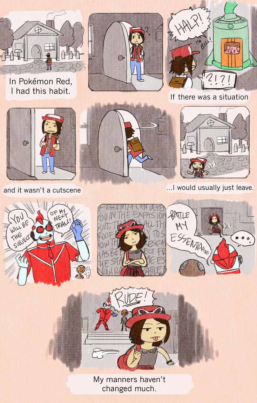
And finally, COMIC! ABOUT POKÉMON! (I'm a very rude person in video games in general, though; spinning around in circles during cutscenes in Assassin's Creed anyone?)


Ideas!

Well, let's start with the hefty parts first:

I keep mentioning here and there of a world-building project I've been working on for my own personal enjoyment as well as something to show for my portfolio. It's basically a remake of the senior thesis I had done a while ago, but with more of the content I wish I could have gone into the first time I had started this.


So here's one of the many characters I've been working on for a bit now. She's still got a ways to go, but this sheet is a good direction towards it. I don't exactly have a name for her yet, so for now we'll just call her Shadow Lady or SL. 


Originally she looked like the person on the top here, but quite a few changes had been made, haha.

So considering that SL's magical attribute are the shadows, I wanted to give her a sort of formless, dark costume to allow her to fit better in the darkness and to represent that mysteriousness as well. She also belongs to the wilder side of the magical world, so I wanted to give her otherwise featureless self a little wildness in the tear of her cloak (as if she had been walking around in the world for many years) and in the haphazard way her clothes under the cloak was put on. 

I liked the idea that when SL used her magic, she would glow from the shadows like how a flicker of the moon would light up the branches of a dark forest on particular places on her body. Her tattoos and the enchantments placed on her clothes would show that glowing etherealness, that she is not quite a normal creature of the earth as she might look from first sight. She also has several raven feathers for summoning/spell purposes on her body and I liked the idea of her having a sheer covering over her dress to give her that wispy appearance.

However, there're still kinks I need to work out (like her facial features and some more work on her clothes....) so she might not even look like this a week from now, haha. 

7.15.2014

More practice with a dose of "omg how did I miss that" x500

So I guess I can call this part of the "quote" project I do once in a while where I illustrate something off of a quote I read or, in this case, draw the actual saying.


The quote this time is "her heart was a secret grade and the walls were very high" from The Princess Bride by William Goldman. I picked this quote in particular because 1) it had few enough words to work into a graphic design/illustration and 2) was articulate enough to describe how I felt about some things in my life.


So, as usual, I first experimented with how I was going to place the words. Initially, I wasn't too concerned with scratching up other thumbnails of different word placements because I wanted to work quickly and just experiment. I tend to have a tendency on being overly concerned with the details from the start and just drawing loosely allowed me to just relax and have fun. 

On one hand, that method was pretty nice and I was able to get to the guts of the main drawing fairly quickly. On the other hand, I forgot there was a reason why I developed my detailed habits in the first place; it made me stop to consider things more carefully and to double check that I wasn't going ahead with something that was going to bite me in the butt further up the process. 

tl;dr: my nonchalance bit me in the butt.


Once I got to the final lineart after a lot of lining up and working with composition (which was fun in its own way with all its structure and straight lines), bumps started to appear immediately. I noticed that "secret garden" was hard to read as it was so condensed and, when I asked various people to try to read it, some kept confusing "high" as "nigh." Haha, numero uno of any graphic design is to make your content legible and, egh, already failed a bit with that.

So I tweaked a few things like outlining "secret garden" in some attempt to make it more legible and made the h's taller. I also centered the words better and added more decor in the areas that felt a bit too bare. I knew I wanted to create a fluid wildness in "secret garden" while the "walls" were to be strong, but unbending with a certain delicacy set into each crevice (check: medieval manuscripts).

I also saw that the S in "walls" was hard to determine because, unlike the word's W where it had some buffer space at the edges of its design, S didn't have that. I think it caused "walls" to look like it was aligned to the right rather than center, but at that point I was like agggggggh and barreled on because, again, practice and learning curves ahoy.


Now there was the coloring process and I fought with it, as usual. I tried to follow the three color rule (where you choose three different colors and basically stick with them to have a decent color scheme) of red, yellow, and green, but I kept fidgeting around with "walls", feeling that the work as a whole was a bit too red heavy and, well, boring to look at. 

So, instead, I said "nah" and "I do what I want" to the three color rule. I changed "walls" into blue and added touches of greenish-blue to the tiny details around the bricks of the word while making the borders more golden for contrast. It came out pretty swell, I think, compared to the original color idea.


Overall, I'm pretty happy how it came out. Even with the mistakes I made on the way, the work as a whole is pretty, I think, with its colors and designs I decided to draw the words into. It can be better, sure, but drawing this was a nice change from the typical illustration stuff I do.

So, yeah, couple of lessons learned:

1) plan/be paranoid in the beginning no matter what
2) letters won't follow your so-called rules of "yeah, that looks alright"
3) legibility is super important because if no one can read what you made, then whaaaaat
4) color rules are irrelevant if breaking them makes stuff look better

These lessons are probably nebulous and prone to change all the time. Next week, I bet those same lessons will just laugh in my face as they frolic away into an alternate universe where they'll decide to maybe work. Yep.


7.08.2014

Practice, practice, and, wow, this is the truest adage in the world, but egggggh

For a random story, when I was kid I was forced to do sheets and sheets of addition, subtraction, multiplication, and division problems. At the bottom of each page there was also this cute little raccoon who would more or less cheer me on with random sayings to keep working. The most common adage the raccoon had was, of course, "Practice, practice, practice!"

Those math problems ended up being the bane of my nine year old life and, in extension, so was that raccoon. Now whenever I hear "practice, practice, practice" I have the weirdest urge to get on my feet and do something randomly violent like flip a table or make some roaring animal noise or something. If I look at another sheet of subtraction problems again, it'll still be too soon.

Haha, weirdness aside, been practicing a lot lately.


I tried out an interesting website app called Atarichan Drawer where the program would randomly give you a body perspective made up of only circles and lines. It was pretty nice, but there were several moments where I had to randomize to another body when I could not tell what in the world a particular chaotic bunch of sphere and lines were. I also wondered here and there if some proportions were off when following the guidelines, but then I'm not so great on that either so who knows. 


I also experimented with the 3D tool in Illustrator and holy moly, I wish I knew about this thing earlier because it's super, super cool. I had so much fun learning this and I definitely have ideas now to use this for some other future projects here and there.


This was my second attempt because I was curious if I could use the 3D tool on handwritten words. The answer is a yes, but it's also pretty illegible with script so I gave up halfway. Still, I learned another option for the 3D tool, a bit of live trace shenanigans, and a bit of no-no's to work around for next practice.

I learned from this guide here, so if you didn't know about this either, try it out! 


Heeeey, look, more concept sketches for that thing-I'm-working-on-but-I-can't-reveal-yet. On another note, head masks and capes are super fun to draw, oh man.


And lastly, this portfolio box/cover I made. It's a temporary container, but it does the job in covering my portfolio and looking nice at the same time. I basically used a shipping box that my prints came in  with and covered the outside and inside with wrapping paper. I encountered a surprising amount of issues trying to make this simple case and most of them were because I kept calculating the inside of the box wrong over and over again. The red wrapping kept warping and wrinkling and, wow, wrapping paper is as scratch resistent as a cat cheerfully shredding curtains. 

Still, I'm happy how it turned out and if I can get a few uses out of it, then I'm pretty swell. 


6.27.2014

Drawing, drawing, drawingggg

Been working on several projects and I'm more or less cleared up on what I'm doing (and I say more or less as in being in a perpetual state that's not unlike riding a bike on pavement full of potholes--I can't even ride a bike, by the way). One of those projects was a graduation gift and though I was deliriously happy that I managed to finish a full work to completion, there was unexpected difficulties getting to there (as usual).

So the assignment was that the image had to have the subject in it with some kind of plane. Alright, cool, that was easy enough. (Hahahahahahahahaaaa.)


Went with several ideas that I eventually cut to these for my friend to choose from. The one that she chose was the girl sitting on the plane with the sun behind her on the second row of thumbnails. So while the others were compositionally and aesthetically more appealing, they didn't follow the requirements.


So trying out something different this time on the process shots. I made it a gif and it's a bit easier to see what I went through. It's a bit...seizure inducing, though, isn't it? Er, sorry about that.


The gif pretty much explains itself. I really like the effort I put in to add more color into the shadows so they're not simply black and gray values. I also love how the shirt came out along with the light source and that window-hatch-thing at the top left? I love that thing ridiculously.  

On the other hand, I can still see some of the things I could have improved on, but decided to drop due to time constraints and simply the case of just messing up after overworking on one thing for so long. So, yeah, there's a bit of a perspective issue with the plane seats, the plane's features are pretty simplified (by the by, it's a DA-40 plane specifically chosen because it was the first plane the subject ever drove and I thought having it represented in the work would be a good reminder to that moment in the subject's life), some anatomy problems with her legs and shoes, and her face. Goodness, her face.

Even now her face doesn't quite look like the subject's and that's a bit of an issue, isn't it? I constantly had to go back and forth with my friend for outside opinion on what I was doing wrong with it and I felt more than a little embarrassed that I couldn't tell on my own for most of it. Still, work was work and I kept asking because, dammit, I had to get it right! I am proud of the effort I went through to the point of what the finished work is showing now, but it's still not quite there in terms of workmanship.

...Eh. I'll get better as long as I keep working and, honestly, I'm satisfied how this came out regardless. Learning curve and all that.

So yeah, in lieu of that, I practiced on faces to relearn them. Haha, it's funny how on some days I'm okay with faces while on others it's like "wow, that's not...that's a whole different creature altogether." I was also practicing facial features for some concept work on a world-building project that's a long time coming yet. Apologies for the bad camera quality.