9.10.2015

More experimenting!

Eyyy, looks like it's the second part of my posting batch eyyyyyy. 

I also forgot to mention in the previous post on why I'm practicing coloring techniques. In general, I tend to find the coloring stage of any drawing I'm working on the hardest and most tedious compared to any other drawing stage. While I do very much love how the work comes together when its colored, I frequently think I should not be so slow or so annoyed at coloring in the first place. Thus this sudden influx of coloring techniques I'm trying to figure out to see which style I might enjoy more or at least learn some skills that might make my own coloring techniques easier to work with. 

Basically, I'm trying to find a coloring style I can work quickly and happily with. If I don't find one, then I'll have a whole bunch of techniques in my repertoire that I can use anytime. Win-win, I think. 

Sooo, this time around the guinea pig is Alistair in this post. He's in the same world as Alice.


This was another coloring technique I wanted to try out, though, again, I didn't quite manage to succeed with what I wanted to do. I was actually trying to draw a half-body (which I succeeded) with a some pattern decor integrated into the BG and the line-less character (which I doubly didn't succeed at) adapted from this drawing here. Somehow I lost track of what I was trying to achieve and ended up experimenting the opposite of line-less art which was hard cell-shading reminiscent to Tetsuya Nomura's works. I also gave up on the pattern design BG once I realized I was going in the complete direction I was supposed to go.

I very much like how the black cell-shading turned out since I don't do that often, but, haha, I was trying to figure out my goal here. Welp, at least I realized how much I enjoyed working with hard blacks and it took a huge chunk of time out of the coloring process so I'll be no doubt returning to fiddle with this style again.


This is a descendent of Alistair (Alex) and I have to admit that this drawing is...weird. This was my first attempt in a while to draw a human face without reference and I think the anatomy of this dude's features suffered because of that. No matter how much I look at this, it just looks really...off.

Bluh, that wasn't the point of what I was trying to achieve regardless. For this one, I was trying to emulate this illustration, but I got very overcomplicated in the end rather than the simple color scheme and blocking you can see in the original drawing. I think I did manage to work out the color contrast that I wanted to try out from the illustration, but, haha, I went my own way again in this experiment. 

Good news is that this didn't come out so bad, I think. I do like how I dealt with the shading, the color scheme, and some parts of the dude's features was pretty fun to detail. I'm absurdly proud of how his mouth and the collarbone area of his shirt turned out. Bad news is that I didn't do what I was supposed to do. Aggggggh. Welp. Gotta try again.


Compared to the others, this one was just for fun. I always draw Alistair as this depressing, solemn dude when he's actually just a mellow nerd, haha. So I challenged myself to draw him smiling. I also wanted to draw out some hair and a rabbit, sooo there you go. Fun stuff!

9.06.2015

Woo! I'm back! Sort of.

Hello, hello again! Life's been unpredictable and busy lately, so I haven't had much time to draw or post as much as I wanted to. Still, it's about time to update this blog so here are some of the drawing experiments I've been working on here and there.


I drew a bunch of old OCs for these experiments, so you'll be seeing this gal, Alice, popping up quite frequently in the next couple of posts. Long story short, I wanted to work with gradient shading and contrasting colors to see how fast/well I could finish a drawing. I also wanted to try out a "glitter" effect from a tutorial by krakenface on tumblr.

The color scheme and gradient effect was a lot of fun to do. I've also always enjoyed working with gold-like/shiny effects so all that glitter and golden lineart on the clouds made me pretty happy. Bad news was that I did not work faster than usual in this coloring style. Perhaps the slowness was lack of practice from working in this way, but I found myself frustrated at times at how much forethought I should have had in coloring certain areas for the gradient work. It's definitely different and more technical than working straight on the canvas for, say, digital painting. All in all, though, I do like the end result and there's no doubt I'll be revisiting this coloring style later on.


Alice again except I wanted to try out drawing clothes on her solely with white lines. I saw the effect on other people's drawings and I thought that was a nifty way of creating form without reinforcing it with darker lineart. So this popped up and I really like how delicate the white lines make the lace on Alice look. This technique also wasn't too hard to do except for a bit of thinking on color management to make the white pop out well enough against everything else.


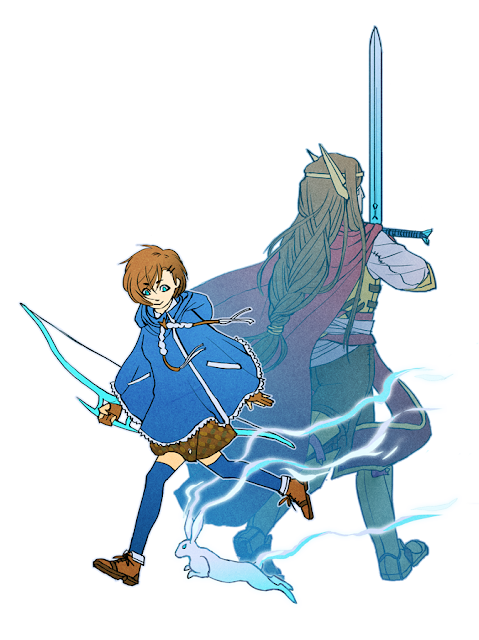
This is Alice with Alistair, her predecessor (kinda). This was another experiment with gradient coloring except I was mostly aiming for a sort of duality picture showing two characters being part of the same coin. I got the idea from a fantastic illustration by paradise008. Funny story is that initially I tried to do the same kind of design paradise008 had created, but somehow I got off the metaphorical tracks on that idea and apparently decided to just slide down a hill of confusion. I ended up with this instead, which, haha, makes the point of what I was trying to do kind of moot. 

Still, I did enjoy how I managed with this drawing. I especially like how both characters' movements echo each other except in different directions and in different motives as well. I was also trying to show a past/present duality, too, and I think I managed that with the faded colors on Alistair. 

So, all in all, got the meaning across, but not so much on what I was trying to do in the first place. Aaaah, I gotta try again!


1.31.2015

Hum, hum~

Some more posting of what I've been doing lately.


This is from a story I've been building very slowly over the years, so it's just more character/world building. For some vague BG, the gloves are standard issue for a magical weapon-smithing group. The three pointed nails are for picking up and manipulating smaller details when needed and the knuckle-busters are there so the smiths can clock the hell outta anyone who messes with them.

And, yes, there's an actual need for them to do some clocking in the story. They're pretty fierce.

Now below is some Tokyo Ghoul fanart. Faiell, the troublemaker, pitched the basic outlines of the plot for me and I got curious enough to read through the manga. I got...really invested in the story and characters. Thus, the fanart.

I was really surprised how much the two drawings below came out, though. They were drawing exercises at the most for another larger illustration I'm still working on, but I'm happily pleased how the colors in the first one below came out and how the scratchy style of the second seemed to accentuate the madness I wanted to draw out. They were pretty fun to do, as fanart tends to be.


Now below the cut is some more fanart stuff, though not as finished.

1.28.2015

I am so sleepy right now, but here's a title, I guess

A couple of things wrapped up recently so I can now come around to posting a couple of things I've finished lately.


Not exactly sure why the above image is darker than usual. I'll have to figure that out in a bit, but for now the actual colors for it is the final image in the WIP gif below.


This started out when I wanted to draw something in pastel tones, bunnies, and a very interesting face mask I saw online. So, haha, I was actually a little surprised that I came up with some kind of pastel goth rabbit with unsettling graphic fangs in the end. 

I named this work Infatuation. I'll have you figure out what that implies with the illustration, haha. Hopefully it's pretty straightforward!

It was really fun to draw something with this sort of viscousness overlaying cuteness; I might do something along this mood again. I also had a lot of fun designing the background pattern and I had a couple of different designs by the end of the illustration. I might get around to doing a whole set of them for the graphic arts side of my portfolio.


Again, colors don't like me and the original color scheme is the last image in the WIP below. What is even going on with this, I swear....


So this was originally for a Fire Emblem: Awakening fanzine, but after some speculation, I decided not to go for it and just post this as is. However, I ended up liking this so much that I'm posting it along with the original work and might use it as a portfolio piece if I can't decide on something better to replace it with.

I originally started this on CMYK as asked for by the fanzine's guidelines and, haha, it was one of the few times I started an illustration on CMYK. Coloring in CMYK was surprisingly painless; it was only when I decided not to use this for the fanzine that things got a little funky. The internet doesn't like CMYK images after all and I had to do a bit of adjusting and changing with color profiles to get it back to what I originally wanted the image to look like in RGB.

...It's honestly typical image adjustment stuff. (makes hand-wavey motions)

As for the actual coloring style, I was originally aiming for oxboxer's style with her delicious way of implementing line weight and gradients to make her finished pieces. I still don't like coloring all that much, so I decided I would try out her style to see if I liked hers. The end result doesn't quite look like oxboxer's, but experimenting with gradient shading and line weights came out pretty well regardless, I think. I could even dare to say I ended up figuring out my own way of using her style to make it my own. I'll try using this method in other pieces, too, since it wasn't too bad figuring it out.

11.18.2014

Hey again!

S'been pretty busy lately and doing some projects here and there. I can't show one of them yet (to play it safe) and the other is still being worked on. I also decided to go back to the illustration I gave up on from the previous entry because I realllly don't want all that hard work to go to waste like that.

But yeah, what I can show is the inktober challenge I tackled last month. The gist of it is that an artist draws something/anything each day of October in ink. So here it is, all in bulk under the cut!