12.02.2015

Inktober 2015

Hey, long time no see! Things have been busy, but I finally got around to updating!

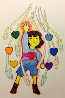
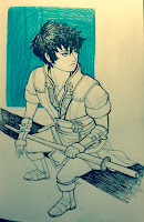
To start with, here's the entire Inktober set:


Whew, that's all of them! Overall, I like what I did for this Inktober much more than the last one, so I guess I improved a bit on figuring out what I wanted to draw for each day. I also got to experiment a lot with the ink pens hanging around my house, so that was pretty fun! 

I gotta say, though, drawing something everyday was more difficult than I expected. I'm not sure why I always get surprised by this every time, but, haha, gotta keep exercising until it stops being surprising I suppose.


9.18.2015

Last of the experiments for now!

More coloring experiments again! 


These two are from another story I've been working on and this time I wanted to try out this technique with its minimal color shading/blocking as well as that interesting white border line that very cleverly holds the entire artwork together in one shape. 

I didn't quite make it the same way, as you can see: the "white" border line should have been thicker/more obvious and the color blocks aren't as simplified or as soft-edged like they are in the original illustration. This attempt sort of ended up looking like paper-cut instead...? 

Haha, still, I had fun trying to figure out how to color block. Despite the strange result that's not quite like the original drawing, I think that if I try again I will probably get better.

The next two were made for fun:


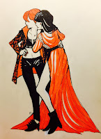
Oh man, oh man! I always loved going nuts with detail and costume design and I had a wild time with this one. For some reason, I wanted to create a color scheme off the weirwood heart tree in Winterfell from Game of Thrones. The author's description of the white wood and the leaves that looked like bloody hands stuck around my head for a long while so I decided to draw something off those details. 


Hmm...I don't have much to say for this one besides enjoying how it came out enough to post it up here.


9.14.2015

Eyyy more stuff!

This time around I did a bunch of background patterns since I was getting tired of the old one. Even though I made a background pattern before, I wanted to create a "simpler" design and, funnily enough, trying to do so was harder than making a complicated looking one.

So, what I knew for sure before starting anything was that I wanted to implement my alter-ego (Rikaneko--a sort of sphinx creature) into the BG design. I knew I wanted some sort of symbolic image of that alter-ego to be the center of attention. I also wanted the color scheme to be blue, though that was just because I wanted to make something blue, haha.

My first attempt was this:


I had a lot of fun drawing the borders, but there were a lot of flaws as a patterned background

  1. It was much too complicated for what I had in mind as a BG as well as being a bit too busy for, well, a background image that's not really supposed to attract that much attention from more important content (like entries).
  2. While the border decoration is intricate, the design didn't quite match so well with the image inside the circle. The image is way too simple, the style doesn't match, and it's a bit boring compared to the busyness surrounding it.
  3. I didn't like how constrained each portion of the BG felt. While I was making the main pattern, I forgot to remember to keep away from the "edges" of the canvas which resulted in each repeat to look box-like. There is no fluidity or flow into each others' spaces to make it less look like a simple copy-and-paste of a BG
  4. It looks like it was made for a bathroom. Just...no. Nope.
Sooo I scrapped this one and took what I learned (what not to do, haha) to create something better.


This was my second attempt. This time around went a little better. I took more time to make the alter-ego image and I decided to go with the theme of stars (though the reasoning behind that is less because I love space and more because star shapes are really pretty, haha). 

Initially, there wasn't going to be a Scorpio star constellation in the pattern, but after I had finished setting up the pattern with only the main image of my alter-ego and a spattering of star shapes, I realized the most of the background looked very empty. Adding the second main image into the pattern made the emptiness a little less and was a learning process all on its own since I didn't plan for it.

Unfortunately, I still wasn't too happy with this BG. I really liked the color scheme, the star theme, and the alter-ego image I had created, but together the BG still looked a little boring. There wasn't that much variety and I thought the main image of the alter-ego was still a bit complicated--it sort of made an imbalance to the entire pattern when compared to how sparse the Scorpio portion of the pattern was.

So I scrapped this one, too, for take three.


Now this was when I was somewhat satisfied. This was the variety I wanted, the color schemes, the star theme, and the fluidity. My first go was the navy/gold pattern, but when I was happy with that I wondered how a more dynamic and lighter color scheme would look, thus the cloud/gold pattern. The latter was surprisingly difficult as I hadn't considered how I would repeat a more textured BG compared to the flat BG in the navy/gold. Luckily, with some tweaking and a handy clone tool it came out pretty nicely!

In the end, I decided to go with the navy/gold one as the final BG I would use across my social media sites (including this one as you can see). I really love how the cloud/gold pattern came out, but the small details (like the constellation) got lost in the BG which I didn't like at all. The navy/gold pattern showed everything a lot easier, blog entries included.

So, in the matter of legibility, I chose the navy/gold. Maybe the cloud/gold pattern would work better with cellphone and notebook covers and the like. Hm.


9.10.2015

More experimenting!

Eyyy, looks like it's the second part of my posting batch eyyyyyy. 

I also forgot to mention in the previous post on why I'm practicing coloring techniques. In general, I tend to find the coloring stage of any drawing I'm working on the hardest and most tedious compared to any other drawing stage. While I do very much love how the work comes together when its colored, I frequently think I should not be so slow or so annoyed at coloring in the first place. Thus this sudden influx of coloring techniques I'm trying to figure out to see which style I might enjoy more or at least learn some skills that might make my own coloring techniques easier to work with. 

Basically, I'm trying to find a coloring style I can work quickly and happily with. If I don't find one, then I'll have a whole bunch of techniques in my repertoire that I can use anytime. Win-win, I think. 

Sooo, this time around the guinea pig is Alistair in this post. He's in the same world as Alice.


This was another coloring technique I wanted to try out, though, again, I didn't quite manage to succeed with what I wanted to do. I was actually trying to draw a half-body (which I succeeded) with a some pattern decor integrated into the BG and the line-less character (which I doubly didn't succeed at) adapted from this drawing here. Somehow I lost track of what I was trying to achieve and ended up experimenting the opposite of line-less art which was hard cell-shading reminiscent to Tetsuya Nomura's works. I also gave up on the pattern design BG once I realized I was going in the complete direction I was supposed to go.

I very much like how the black cell-shading turned out since I don't do that often, but, haha, I was trying to figure out my goal here. Welp, at least I realized how much I enjoyed working with hard blacks and it took a huge chunk of time out of the coloring process so I'll be no doubt returning to fiddle with this style again.


This is a descendent of Alistair (Alex) and I have to admit that this drawing is...weird. This was my first attempt in a while to draw a human face without reference and I think the anatomy of this dude's features suffered because of that. No matter how much I look at this, it just looks really...off.

Bluh, that wasn't the point of what I was trying to achieve regardless. For this one, I was trying to emulate this illustration, but I got very overcomplicated in the end rather than the simple color scheme and blocking you can see in the original drawing. I think I did manage to work out the color contrast that I wanted to try out from the illustration, but, haha, I went my own way again in this experiment. 

Good news is that this didn't come out so bad, I think. I do like how I dealt with the shading, the color scheme, and some parts of the dude's features was pretty fun to detail. I'm absurdly proud of how his mouth and the collarbone area of his shirt turned out. Bad news is that I didn't do what I was supposed to do. Aggggggh. Welp. Gotta try again.


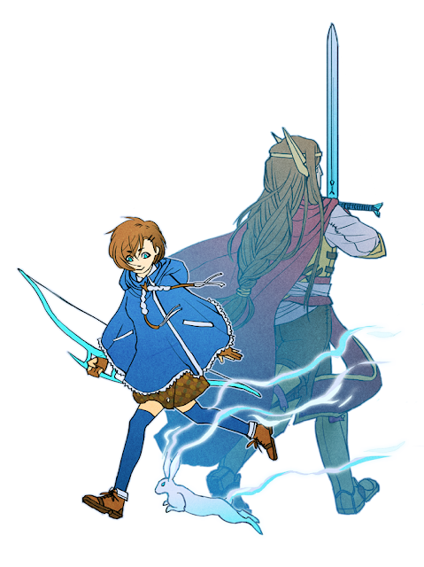
Compared to the others, this one was just for fun. I always draw Alistair as this depressing, solemn dude when he's actually just a mellow nerd, haha. So I challenged myself to draw him smiling. I also wanted to draw out some hair and a rabbit, sooo there you go. Fun stuff!

9.06.2015

Woo! I'm back! Sort of.

Hello, hello again! Life's been unpredictable and busy lately, so I haven't had much time to draw or post as much as I wanted to. Still, it's about time to update this blog so here are some of the drawing experiments I've been working on here and there.


I drew a bunch of old OCs for these experiments, so you'll be seeing this gal, Alice, popping up quite frequently in the next couple of posts. Long story short, I wanted to work with gradient shading and contrasting colors to see how fast/well I could finish a drawing. I also wanted to try out a "glitter" effect from a tutorial by krakenface on tumblr.

The color scheme and gradient effect was a lot of fun to do. I've also always enjoyed working with gold-like/shiny effects so all that glitter and golden lineart on the clouds made me pretty happy. Bad news was that I did not work faster than usual in this coloring style. Perhaps the slowness was lack of practice from working in this way, but I found myself frustrated at times at how much forethought I should have had in coloring certain areas for the gradient work. It's definitely different and more technical than working straight on the canvas for, say, digital painting. All in all, though, I do like the end result and there's no doubt I'll be revisiting this coloring style later on.


Alice again except I wanted to try out drawing clothes on her solely with white lines. I saw the effect on other people's drawings and I thought that was a nifty way of creating form without reinforcing it with darker lineart. So this popped up and I really like how delicate the white lines make the lace on Alice look. This technique also wasn't too hard to do except for a bit of thinking on color management to make the white pop out well enough against everything else.


This is Alice with Alistair, her predecessor (kinda). This was another experiment with gradient coloring except I was mostly aiming for a sort of duality picture showing two characters being part of the same coin. I got the idea from a fantastic illustration by paradise008. Funny story is that initially I tried to do the same kind of design paradise008 had created, but somehow I got off the metaphorical tracks on that idea and apparently decided to just slide down a hill of confusion. I ended up with this instead, which, haha, makes the point of what I was trying to do kind of moot. 

Still, I did enjoy how I managed with this drawing. I especially like how both characters' movements echo each other except in different directions and in different motives as well. I was also trying to show a past/present duality, too, and I think I managed that with the faded colors on Alistair. 

So, all in all, got the meaning across, but not so much on what I was trying to do in the first place. Aaaah, I gotta try again!